Monday, July 16, 2012

Design Your Own Fabric...And, I'm Moving!

Just a quick note to my lovely readers... Return To Home is moving!  After today, you can find me at www.returntohomeinteriors.com.  Please come on over and subscribe to my blog from there!


Many of us know that retailers like Fabric.com, Calico Corners, or Joann Fabrics are great resources for affordable, accessible fabric.  But sometimes the selections can feel a bit limited, especially if you have something super specific in mind and can't find it.  


That's why I was thrilled to find Spoonflower.com - a website where you can design your own fabric and have it printed out at a reasonable price!  Or choose from countless patterns that users before you have created. I swear these guys don't sponsor me (but hey that's not a bad idea...!).  I'm just a really big fan of this site. 


I had my "Spoonflower a-ha" moment recently when thinking through window treatment ideas for a new client of mine.  I thought a bright blue, graphic print for her son's bedroom roman shades would look terrific against his grass green walls.  I can't get David Hicks' La Fiorentina pattern out of my mind!


Here it is on a nursery daybed:


But it's so expensive, and also doesn't come in the color I'm envisioning.  Enter Spoonflower!  

Found this beauty in the perfect color, and it's only $18 a yard:

Connect the Blocks-Navy


It's slightly different from La Fiorentina, but you wouldn't know that just glancing at it.  

Here are some other great Spoonflower fabrics that I'd love to purchase for curtains, throw pillows and the like:


coral ikat fabric by domesticate on Spoonflower - custom fabric


Summer Mums in charcoal fabric by domesticate on Spoonflower - custom fabric


Indian Clover in moss fabric by domesticate on Spoonflower - custom fabric


Chocolate Ogee fabric by sparrowsong on Spoonflower - custom fabric


cestlaviv_teal two step fabric by c'est_la_viv on Spoonflower - custom fabric


There are also some collections.  Like this teal and orange Ikat selection:

Ikat Diamonds - blue fabric by fable_design on Spoonflower - custom fabric

                                             Butterfly Girl-Orange fabric by fable_design on Spoonflower - custom fabric


 Ikat Arrows - blue fabric by fable_design on Spoonflower - custom fabric


Apparently people use Spoonflower to start their own fabric businesses! Like these guys, they have a whole line:


Do you have any fun fabric resources that make decorating more affordable and easier?  Do tell!


Wednesday, July 11, 2012

A San Francisco Home: Before & After

I can't get enough of a good "before and after".  Please tell me I'm not the only one??  I spend way too much time watching HGTV, and any time I see "Before and After" featured in an interior design magazine I go weak in the knees!  


Imagine how thrilled I was when my friend Carey agreed to let me feature some of her very own "before and after" shots of her fabulous home in San Francisco.  Carey is a friend from grad school, and over the years we've bonded over our love of home design.  She has terrific taste - just look at what she's done with this place!  


To begin, let's check out the exterior of the house.  Here's the "Before":


And the "After".  Amazing what some nice gray paint and white trim will do to perk up a place!  I also really like the front door and garage door - very polished and the black really packs a punch. 


Now, let's venture inside.  

The dining room, Before:


 And, After.  Mind you, there's nothing wrong with this room!  But once she implemented some changes.... pow! 

Isn't that such a great change?  The room is so clean and bright.  Loving that quatrefoil pendant lamp - I hope the "quatrefoil craze" continues for a while - so classic, so pretty.  (The paint color is Restoration Hardware's Graphite).


The living room Before:

And...presto.  Even Wrigley the dog looks better!  

Another shot below.  Her style is truly transitional - clean, modern, classic.  Loving that paint color, by the way... you can't go wrong with a nubby neutral gray (the exact color is Restoration Hardware's Stone). 


Just look at how different this kitchen is, Before:


And After:


A new kitchen "island" (from Crate & Barrel, I believe), newly painted walls, new cabinet doors, hardwood floors and a new light fixture.  It really transforms the space. 

Another shot - Before:


And After:


One of my favorite change-ups is the master bedroom.  Because of the construction of the room, they originally had to position the bed sort of at a diagonal... 


Some new built-in shelves and a distinct place for the bed... and wow - what a difference!  


Check out this amazing transformation.  Here we have a run-of-the-mill powder room.  It's not bad!  Totally fine!  


But wow, what a difference some beadboard, wallpaper and new floors make.  Here is the after:


Another shot, Before:


And After:


The wallpaper is Schumacher's "Imperial Trellis" (designed by Kelly Wearstler!) that never gets old.  I wonder if my friend Carey knows that Chloe Sevigny also put this wallpaper in her powder bath?? 


Carey and her husband Noah recently purchased a beautiful new home, also in San Francisco, and plans are already afoot for some pretty serious changes.  I don't know about you but I'm seriously excited to see what they do.  Carey, bravo on a beautifully transformed space and thanks for inviting us in!

I have some news of my own... soon I will be moving this blog to its own website!  Working diligently as we speak - in the next week or two I'll be asking you to follow me "over there"...


Sunday, July 1, 2012

Happy 4th - Good Old Red White and Blue

What do you think of red, white and blue in interior design?  I always thought it could look a little too Americana or 1980s country.  BUT! I was able to find some really fantastic red, white and blue rooms that have convinced me it's a color scheme that can totally work.


This is very Chinoiserie in feel - loving this bath tub too.  These stand-alone tubs are very in right now!  


Such a crisp and preppy boy's room.  Love!
{ Via Decorpad }


This is beyond Chinoiserie.  Just love that dragon wallpaper and the coral red mirror. An entry hall you will never forget!


Jonathan Adler inspired red white and blue:
{ Via Elle Decor }


Isn't this navy so nice and polished?  The dark red chairs are a nice complement - not TOO red:
{ Via Emily Clark }


I'm totally in love with this room.  The headboard alone makes me swoon... and perfectly paired with that slate blue gray wall:
{ Meredith Heron Design, Via Decorpad }


Another little boy's room. Look at that fabulous graphic print roman shade.  And there's that navy and white rug again. Versatile!


This room is so very welcoming.  I think the contemporary red lamp and the artisanal coffee table really save this room from looking too nautical.  And hey look at those rope ottomans - what a great addition to the room:  
{ Via Little Nudge }


Happy July 4th, everyone!

Hopefully your holiday looks a little bit like this...


Or this...


Or this...
{ Via Life of Splendor. A fabulous outdoor party that you can read about here! }


I'd love to watch some fireworks from a porch like this:

{ Via BHG }


We are in California this week, reconnecting with family and friends, and enjoying the PERFECT weather and backyard pool.  

Wherever your plans take you, may it be fun and frolicky, and full of happy times.  See you next week!


Tuesday, June 26, 2012

Rope! Summer-Inspired Decor

Doesn't nautical rope just say "Summer"?

rope.


Everywhere I look, people are finding terrifically creative uses for rope in their decor.  It's the most perfect decor element, especially for the summer - neutral in color but textured so it's interesting to look at, and it also adds a touch of whimsy:  

rope in bowls. so easy!
{ Via Little Nudge }


rope


I absolutely love this look, but I have to admit I might lay awake all night worried that the bed would break!

rope
{ Via Pinterest }


Rope
{ Via Pinterest }


Rope!


This rope banister is one of my favorites, by interior designer Thom Filicia. How clever to put a big piece of rope where he could have just installed a boring old banister:

{ Via Pinterest }


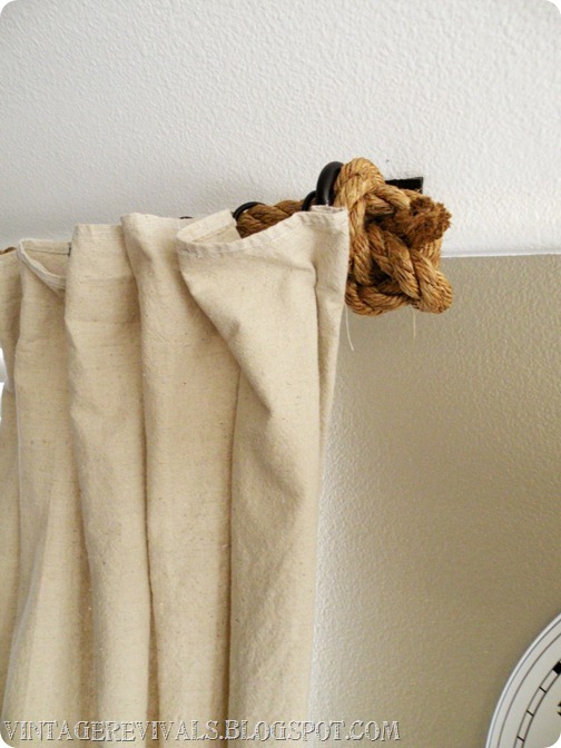
This is one of my all-time favorite DIY projects, by Mandi of the blog Vintage Revivals.  Her "Rope Curtain Rod" for her friend Hailee's complete living room makeover has all the trappings of a perfect DIY project - aesthetically beautiful, clever, easy and cheap!

diy-rope-curtain-rod

DIY-curtains

rope-curtains
{ Images above via Vintage Revivals }


Isn't that last shot just fantastic?  The way they pulled the rope down the wall and looped it around like that? 


Here's another fabulous DIY project idea from Design*Sponge - the "Knotted Lamp Cord".  I thought it looked pretty easy!  I love that it's just a perfect mix of "industrial" and "artisanal":


{ Via Design*Sponge }


Of course, you don't have to go DIY crazy to incorporate some fun, fabulous rope into your home.  All kinds of retailers are getting in on the action, so you can just buy your way to instant gratification.  


Here's a rope knot door stop by Ballard Designs; it would also look great as a cool accessory on your bookshelf:

{ Via Ballard Designs, $45 }


Would you ever guess these mirrors are from Pottery Barn?  I think they are just great:

{ Via Pottery Barn, $349 }


If you caught my blog a few weeks ago, you already know how much I love a good pouf! Here's one I spotted on a recent visit to interior design store Haus Interior in downtown NYC:   


Another version you can purchase online:
Seafarer's Rope Ottoman
{ Via Nautical Luxuries, $325 }


Hope you are as inspired as I am to incorporate some fabulous rope into your home!  

How is the summer treating you so far?  We visited friends of ours upstate and spent the entire weekend in the pool, followed by grilled hamburgers. Now is that *summer* or what?